The ADMIN K.P.I. is where managers/owners/coordinators/decision-makers go to be able to examine real-time data that is relevant to their club. What better way to start off your day other than being able to take a look at the big picture of your operation?
To access this tool, on the main menu bar place your cursos over "Home" and select "Admin KPI" from the dropdown menu.
In this section you will see a dashboard that allows quick and easy access to data for 6 different categories: ATTENDANCE, TASKS, FITNESS, GRP. ACTIVITY, ACCESSES and MEMBERS COMM.
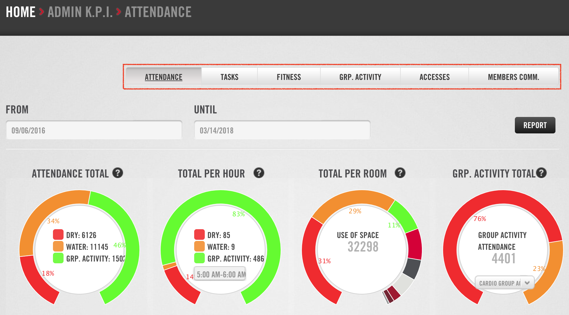
The ATTENDANCE tab displays data relevant to general or specific attendance in your facility. First, set the dates you would like to view in the "From" and "Until" fields. You can then analyze the data in the gauges below:
- ATTENDANCE TOTAL. General attendance by area: DRY-fitness areas, WATER-pool, sauna, etc., and GROUP ACTIVITY.
- TOTAL PER HOUR. Area attendance by hour. Choose the time you want to check attendance for by selecting it from the drop-down list. You may only consult whole hours (i.e. 5:00AM to 6:00AM).
- TOTAL PER ROOM. Attendance by room. Hover your cursor over the different colors on this gauge to see the attendance counts for the different rooms/areas in your facility.
- GROUP ACTIVITY TOTAL. Attendance by group activity. Choose the activity category from the drop-down list. Hover over the different colors on the gauge to see attendance for classes in the category you have chosen.
Next, let's take a look at the TASKS tab.
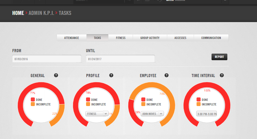
This tab displays data relevant to daily work tasks (i.e. doing a weigh-in, creating an email campaign, checking inventory) across different departments in your facility. Set the dates you would like to view in the "From" and "Until" fields. You will see 4 gauges showing:
- GENERAL: The ratio of completed tasks to incomplete tasks.
- PROFILE: The ratio of completed tasks to incomplete tasks by task profile (department). Select the task profile you would like to see from the dropdown menu inside the gauge.
- EMPLOYEE: The ratio of completed tasks to incomplete tasks by employee. Select the employee you would like to see from the dropdown menu inside the gauge.
- TIME INTERVAL: The ratio of completed tasks to incomplete tasks by time of day. Select the time period you would like to see from the dropdown menu inside the gauge.
Moving on to the FITNESS tab.
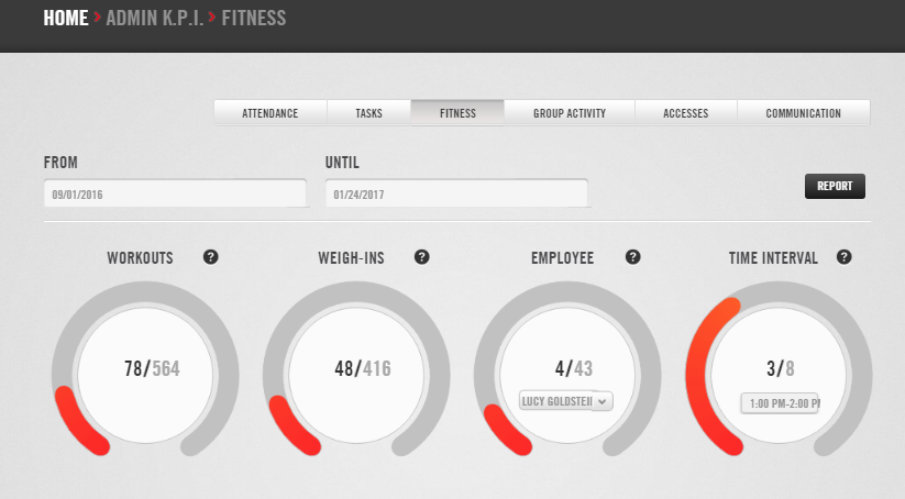
This tab displays information workout programming and weigh-ins. Set the dates you would like to view in the "From" and "Until" fields. There are 4 gauges that display:
- WORKOUTS: The ratio of programmed workouts to the target number.
- WEIGH-INS: The ratio of completed weigh-ins to the target number.
- EMPLOYEE: The ratio of workout plans and weigh-ins completed to the target number for each employee. Select the employee you would like to see from the dropdown menu inside the gauge.
- TIME INTERVAL: The ratio of programmed workouts to the target number for all employees based on time interval.
The GRP. ACTIVITY tab is next.
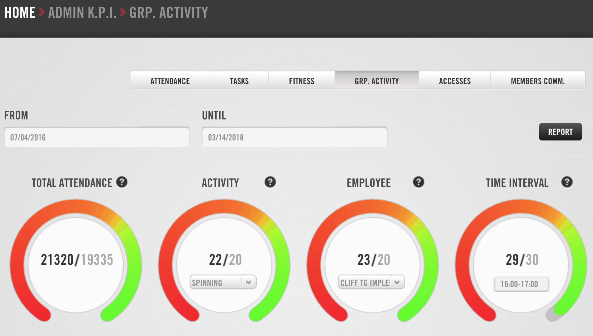
This tab displays information about group class performance in your facility. Set the dates you would like to view in the "From" and "Until" fields. These 4 gauges show:
- TOTAL ATTENDANCE: The ratio of actual attendance to target attendance.
- ACTIVITY: The ratio of attendance for all classes given in a specific activity to the target attendance. Select a class from the dropdown menu inside the gauge.
- EMPLOYEE: The ratio of attendance for a specific instructor's classes to the target attendance. Select an instructor from the dropdown menu inside the gauge.
- TIME INTERVAL: The ratio of attendance for all classes per hour to the target attendance. Select a time slot from the dropdown menu inside the gauge.
Up next, the ACCESSES tab.
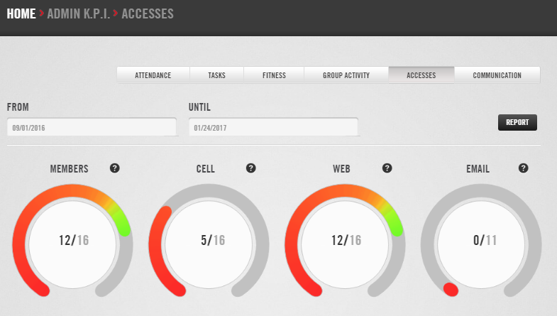
This tab displays data in regards to how members have visited with your club whether it be in person or via the Trainingym software you have licensed. Set the dates you would like to view in the "From" and "Until" fields. The 4 gauges below the date range display:
- MEMBERS: The ratio of members who have entered your facility via turnstile to the total number of active members.
- CELL: The ratio of members who have accessed their account via app to the total number of active members who have a Trainingym account.
- WEB: The ratio of members who have accessed their account via webpage or kiosk to the total number of active members who have a Trainingym account.
- EMAIL: The ratio of welcome emails sent to the number of new sign-ups (during the selected dates).
And last but not least, the MEMBERS COMM. tab.
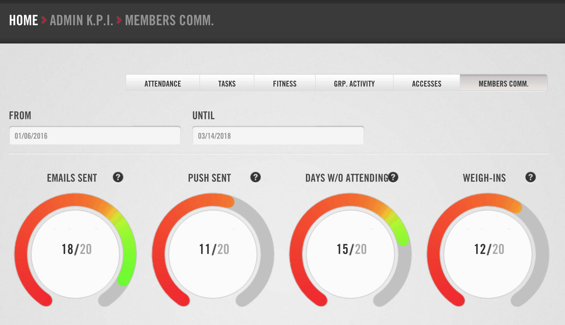
This tab displays statistics on communications between your club and members. Set the dates you would like to view in the "From" and "Until" fields. You will see 4 gauges that show:
- EMAILS SENT: The ratio of emails sent to the total number of active members..
- PUSH SENT: The ratio of push notifications sent to the total number of active members.
- DAYS W/O ATTENDING: The ratio of members sent a "days without attending" email to the total number of active members.
- WEIGH-INS: The ratio of members sent a weigh-in reminder to the total number of active members.